illustrate_signal plots the given uniaxial signal in illustration diagram style.
Illustration diagram style hides axes markers, unnecessary guidelines.
illustrate_signal(
  data,
  point_size = 0.3,
  plot_point = TRUE,
  line_size = 0.3,
  plot_line = TRUE,
  range = c(-2, 2),
  plot_maxed_out_line = TRUE,
  plot_origin = TRUE,
  title = NULL,
  plot_title = TRUE
)
Arguments
- data
data.frame. The input uniaxial signal. First column should be timestamp.
- point_size
number. The size of the plotted data point.
- plot_point
Bool. Plot signal as points if TRUE.
- line_size
number. The line width of the plotted signal curve.
- plot_line
Bool. Plot signal with curve if TRUE.
- range
vector. Dynamic range of the signal.
- plot_maxed_out_line
Bool. Plot dynamic range lines if TRUE. Dynamic range is set by `range`.
- plot_origin
Bool. Plot the 0 horizontal line if TRUE.
- title
Char. The title of the plot.
- plot_title
Bool. Plot title if TRUE.
Value
ggplot2 graph object. The graph to be shown.
See also
Other visualization functions.:
generate_interactive_plot(),
illustrate_extrapolation()
Examples
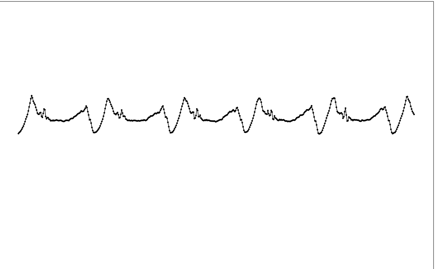
# Use sample data for testing
df = sample_raw_accel_data
# Plot it with default settings
illustrate_signal(df)
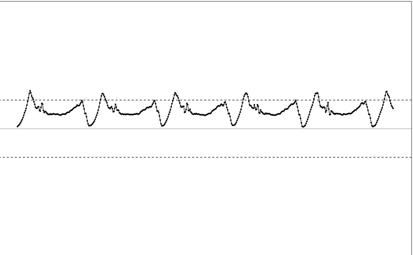 # Plot with a different style
illustrate_signal(df, point_size=1, line_size=1)
# Plot with a different style
illustrate_signal(df, point_size=1, line_size=1)
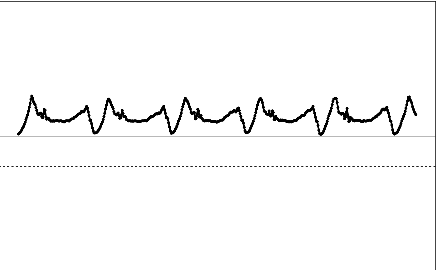 # Turn off annotation lines
illustrate_signal(df, plot_maxed_out_line = FALSE, plot_origin = FALSE)
# Turn off annotation lines
illustrate_signal(df, plot_maxed_out_line = FALSE, plot_origin = FALSE)
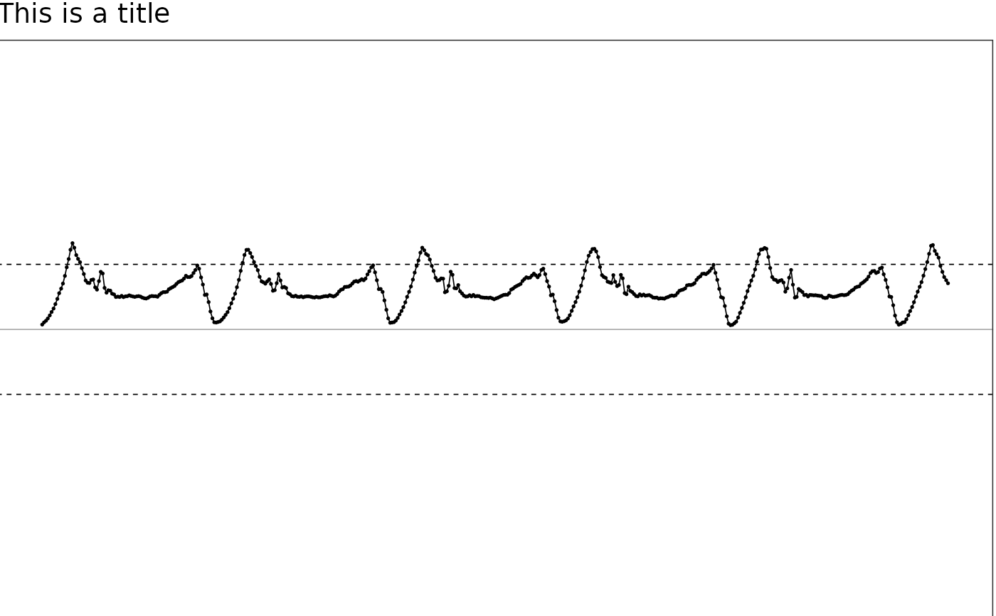
 # Use title
illustrate_signal(df, plot_title=TRUE, title = "This is a title")
# Use title
illustrate_signal(df, plot_title=TRUE, title = "This is a title")